Why All World Maps are WRONG
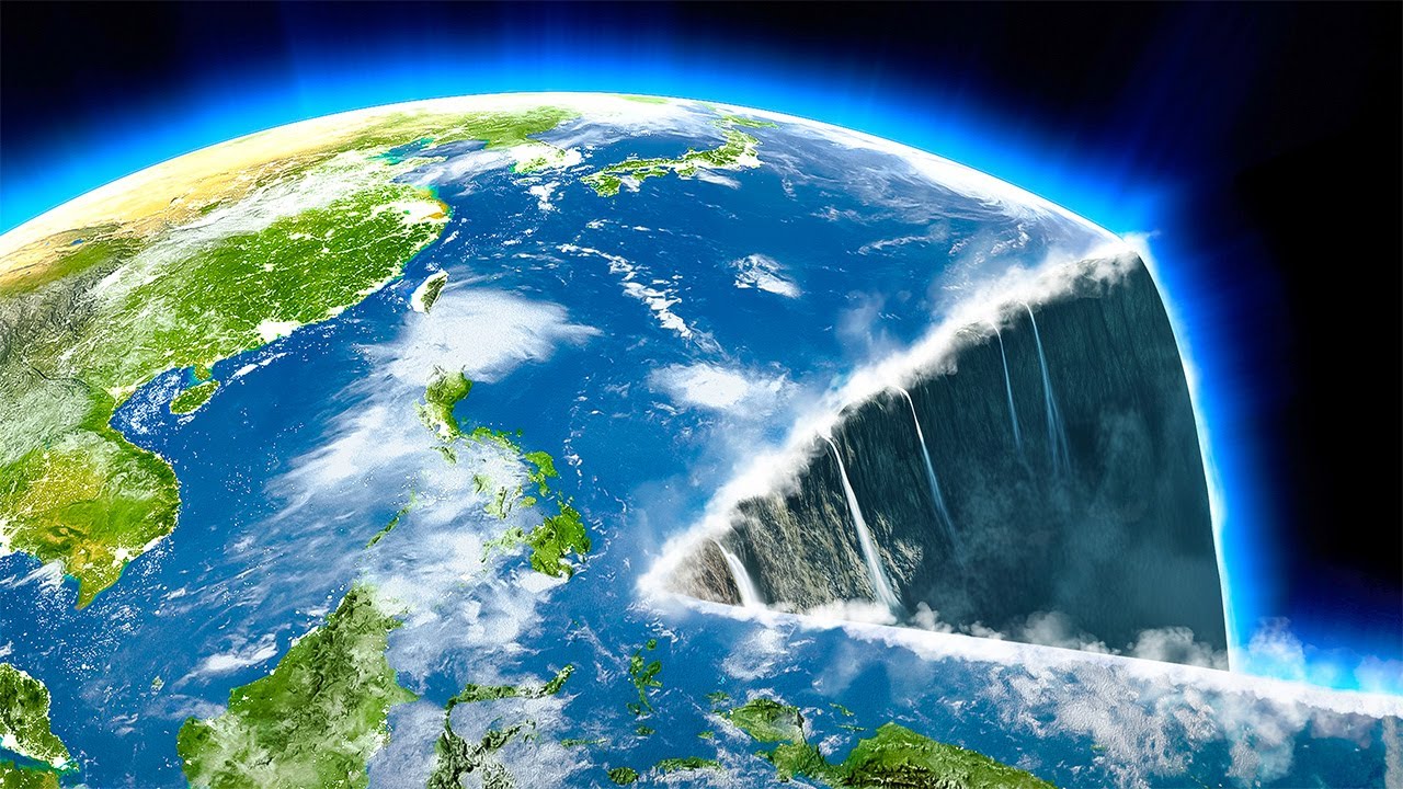
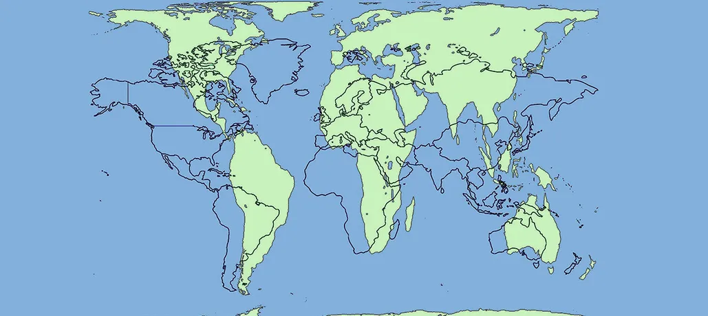
The maps you trust are often inaccurate. A good example is the Mercator Projection world map, created by geographer Gerardus Mercator in 1569. This is the most popular map but does not reflect the true size of the continents. Since the earth is a three-dimensional sphere, when presented on a two-dimensional plane, the landmasses are distorted. For example, Greenland on this map appears larger than South America, but in reality South America is eight times larger than Greenland.
Despite this, Mercator maps are still widely used because they are accurate in distances and angles, making them useful for navigation. However, many alternatives have been developed, such as the Gall-Peters, Daxion, and Miller maps, but each has its own drawbacks. Some maps focus on actual size, while others try to keep the shape true.
Other examples of distortion include Africa, the “disadvantaged” continent on the Mercator Projection. In reality, Africa is three times the size of the United States and large enough to contain China, India, the United States, and Europe. Similarly, Antarctica, which appears as a giant ice wall on the Mercator, is actually only about half the size of North America.
Additionally, Mercator maps often leave out smaller countries like New Zealand and Madagascar. Many commercial maps don’t even show New Zealand at all. This is largely due to carelessness and the fact that maps are often centered on Europe.
Finally, it’s important to remember that no map is perfect. From ancient maps like the Babylonian Imago Mundi, to modern maps, they are all just interpretations of our complex world. When using maps, always remember that they are not completely accurate, but they are still useful tools for understanding our planet.
The map illustrates Babylon situated on the banks of the Euphrates, surrounded by eight circles symbolizing various regions, such as Assyria. Encircling these is a ring representing the ocean, and beyond that are eight triangles indicating further regions of the world. While this map leaves much to the imagination, it’s impressive considering it was carved over 2,000 years before the globe’s first circumnavigation in 1522.
Fast-forward a few centuries, we encounter the Posidonius map, reconstructed in 1628. Originally crafted by Posidonius, who lived between 135 and 51 BCE, this map depicts the known world, including Europe, North Africa, Arabia, and parts of Asia. It reflects a shift from the flat-earth concept. Posidonius even used the star Canopus to estimate Earth’s circumference at 24,000 miles—shockingly close to the actual 24,901 miles. Remarkably, 100 years earlier, the Greek polymath Eratosthenes had calculated Earth’s circumference to be between 24,427 and 25,250 miles, a margin of error between 2.4% and 0.8%. It’s astonishing that such accuracy was achieved over 2,000 years ago, especially given that flat-earthers still exist today.
Maps have always been more than just tools for navigation—they’re cultural and artistic expressions too. Consider Australian Aboriginal songlines, a unique mapping form. These complex songs and dances recount mythical creator beings’ journeys across Australia, referencing real-world landmarks and locations. When sung, they guide knowledgeable individuals through the land. In visual form, these songlines use intricate patterns and symbols to represent geographic points, some covering over 2,000 miles. Anthropologists have documented people successfully navigating vast distances in the harsh Australian Outback using songlines alone. Some songlines even reference geographic features that dried up over 7,000 years ago.
Similarly unconventional is the Native American Catawba map, drawn on deer skin. Instead of depicting geography, this map uses circles to represent indigenous groups in South Carolina and squares for European settlers. The size of these shapes correlates with population, making it more like a diplomatic map than a geographic one. Another Native American map from 1825 measures land not by distance but by travel time between locations, reflecting an entirely different perspective on mapping.
The Inuit people offer another fascinating approach with their wooden carvings, known as Ammassalik maps, from the 1880s. These three-dimensional carvings represent Greenland’s coastlines and were crafted by a hunter named Kunuk. While beautiful, they’re challenging for outsiders to interpret—further proof that maps are as much about the viewer’s understanding as they are about the mapmaker’s skill.
Some maps, however, have been intentionally misleading. In 1906, explorer Robert Peary collaborated with the San Francisco Call to create a map featuring a fictional continent named Crocker Land, intended to please his financier, George Crocker. Political and social pressures can also shape maps. For instance, posting a map of a hypothetical Kurdistan, a nation never established, could result in social media bans due to political sensitivities. Similarly, Kashmir’s disputed borders between India and Pakistan lead Google to show different map versions depending on the viewer’s location.
Even historical maps can be shockingly inaccurate. Take the 1402 Korean world map, which portrays the world as a bizarre blob with Korea prominently featured but distorted continents elsewhere. Yet, when mapping their own land, Koreans were impressively precise, as seen in an 18th-century map showcasing the country’s provinces in vibrant colors.
Artistic maps have their place too. The Fool’s Face Map from the late 16th century humorously depicts the world as a jester’s face, accompanied by Latin phrases like “Vanity of vanities, all is vanity,” critiquing human folly. On the other hand, maps like the 1533 depiction of California as an island persisted for 200 years, stemming from the Spanish explorers’ initial assumption without further investigation.
Finally, there’s the infamous 1893 “square and stationary Earth” map by Professor Orlando Ferguson. Despite spherical Earth theories dating back to the Greeks in 240 BCE, Ferguson insisted on a flat Earth based on his religious beliefs. His map placed continents in the center of a giant mold-like basin, surrounded by ocean. Modern flat-earthers surprisingly cling to similar ideas, emphasizing the power of belief over centuries of evidence.
In conclusion, maps reveal far more than just geography—they reflect art, culture, politics, and even the mapmaker’s biases. From Aboriginal songlines to satirical maps, they challenge our understanding of the world in surprising ways. Which of these map projections fascinated you the most?


